Roundups
The Top 10 Portfolio Templates in Framer

Most portfolio advice starts by telling you a portfolio matters. You know that. What you probably don't know is which of the 400-odd portfolio templates on the framer marketplace still hold up once you put real work into them.
I build framer templates for a living, so I've pulled apart more of these than is healthy. Ten made the list. Four of them are mine, flagged clearly, with the same honest caveats as everything else.
how i picked these
layout under pressure. does it still work when you have three projects instead of nine, or a case study twice as long as the placeholder
cms structure. are case studies actually collection-driven, or hardcoded pages you'll have to duplicate by hand
type quality. the single fastest way to tell a considered template from a padded one
weight. heavy scroll libraries look great in a demo and cost you on mobile
time to yours. how many hours from duplicate to publish
Design quality was the floor, not the ranking. Everything here looks good. The order comes down to which ones stay good six months in.
Templates | Best for | Pages | CMS | Price |
|---|---|---|---|---|
1. Fuel | agencies wanting instant credibility | 6 | 2 | Free |
product designers who want a premium personal brand | 4 | 2 | Free | |
| photographers and visual creatives with imagery strong enough to lead | 4 | Paid | |
| freelance designers who need the site to close, not just impress | 4 | 2 | Free |
1. Calder

Best for
solo designers and one-person studios whose name is the brand
The whole layout is built around a single decision: your name set enormous in a high-contrast serif, in a blue that doesn't apologise. Everything else, from the pill-shaped service tags to the two-column work grid to the stats row, sits quietly underneath it. Most portfolio templates hedge by giving equal weight to work, about, and services. Calder doesn't, and the identity lands harder for it. (Calder is one of mine, disclosure at the top of this post.)
pages [X] · cms [X] · light, electric blue · free
What stands out
the booking calendar in the footer removes the contact-form step entirely, people pick a slot and leave
work grid holds up at four projects or twelve, no awkward gaps
What to watch
The oversized name lockup is the template. Long names or multi-word studio names break the line and the whole thing loses its nerve. Test yours before you commit.
2. Fuel

Best for
studios and agencies that need to look established from day one
Fuel took best template of the year at the Framer Awards 2025, and the win holds up. The balance between whitespace and content is the part worth studying: most agency templates fill space because empty space feels like a missing feature. Fuel doesn't, and the result reads as confidence rather than caution. Veloxthemes
pages 6 · cms 2 · light, neutral · free
What stands out
animations are motivated rather than decorative
holds its polish whether you have four case studies or fourteen
What to watch
Popular enough that other people's sites will look like yours. If you use it, change the type.
3. Vertical

Best for
visual artists and multidisciplinary creators who need a site that isn't a portfolio grid
Most portfolio templates are built to sell a service. Vertical is built to make an argument. The stacked display type is the whole spine of the page, and the numbered phase markers and small mono labels running alongside it give the work an exhibition catalogue feel rather than a case study feel. Its own copy says it out loud: it isn't a portfolio, it's a record. That framing is doing real work here, and it's why the acid green on black doesn't read as a trend choice.
pages 4 · cms [X] · dark, acid green · paid
What stands out
section variety is unusually deep, with concept, process, philosophy, and exhibition blocks alongside the standard work grid
the type scale actually holds on phone instead of collapsing into a smaller version of desktop
What to watch
It's an opinionated shell and it needs feeding. With eight sections of narrative structure, thin projects will look thinner. Bring writing, not just images.
4. Portavia

Best for
freelance designers who need the site to close, not just impress
This is the most complete template in the roundup in terms of pure section count: services accordion, stats, project grid, testimonials with pull-out metrics, FAQ, blog, and a full contact form. Nothing here is decorative. The FAQ answering scope, timeline, and revisions before a prospect has to ask is the tell that it was built by someone who has actually run a freelance pipeline. It's less about looking rare and more about removing reasons to leave.
pages 5 · cms 2 · light, indigo accent · free
What stands out
testimonial block pairs quotes with hard numbers, which does more for trust than either alone
the split "DIGITAL / DESIGNER" hero lockup gives it a real identity despite the conventional structure
What to watch
Every section expects content. Without testimonials, stats, and blog posts you'll be shipping a page full of visible gaps, and this layout doesn't hide them well.
5. Fabrica

Best for
studios that sell on proof rather than personality
Six pages that cover a full studio site: home, projects, studio and about, blog, contact, and legal. The projects page is where the money is here, with native filtering and search built in, so a studio with thirty case studies gets a browsable archive rather than an endless scroll. Home runs the standard conversion sequence, positioning statement into stats into work into testimonials into a call to action, but tuned so each block is short and moves you along instead of asking you to stop and read. Strict black and white throughout, animated but restrained. It's the structure of a pitch rather than a gallery, and it stays coherent whether you fill it out or run it lean.
pages 6 · cms 3 · dark, monochrome · $129
What stands out
native CMS filtering and sorting on the projects page without plugins or custom code
the floating contact card in the hero puts a human and a next step above the fold
What to watch
Single-use license, so one site per purchase. And pure black and white means your imagery carries all of the visual weight. Weak photography has nowhere to hide here.
6. Manner
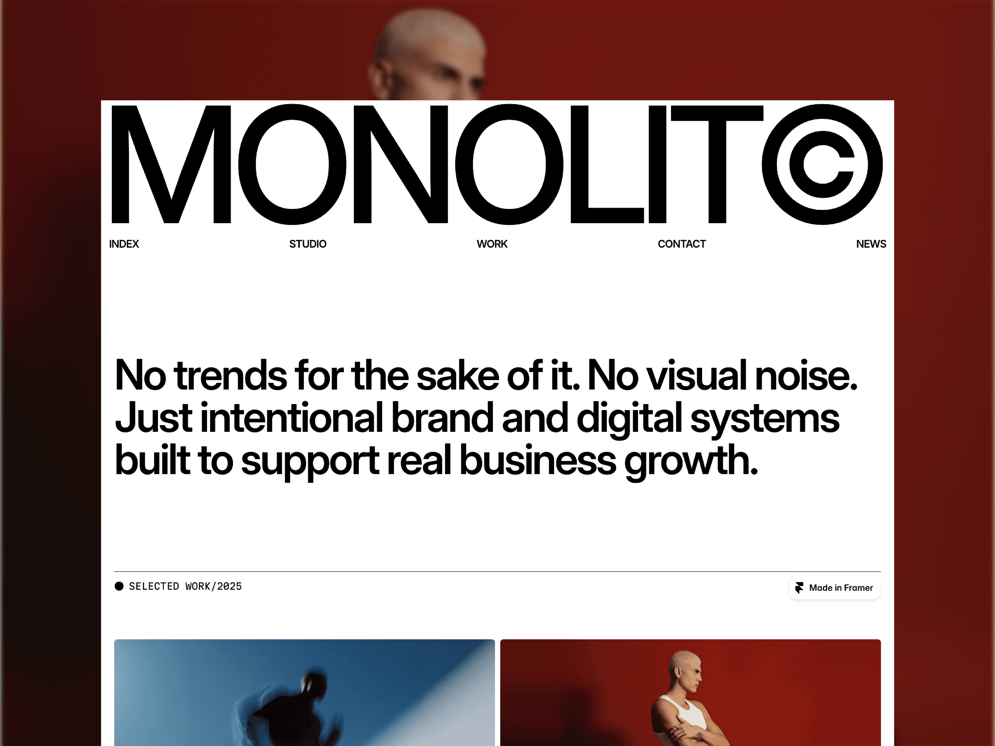
Best for
studios that want the site to read like a document, not a showreel
Six pages covering home, studio, work, news, contact, and legal, with CMS running the work and news collections. The homepage is sequenced the way a studio actually explains itself: the wordmark and nav fill the fold, then a plain-language positioning paragraph with client names inlined, then selected work, then a partner list, then services as a numbered accordion, then a three-step approach, then recent insights, then contact. No hero video, no stat counters, no testimonial carousel. Black and white throughout with type doing the structural work, which is why it holds together whether you have three case studies or fifteen. (Manner is one of mine, disclosure at the top of this post.)
pages 6 · cms 2 · light, monochrome · $49
What stands out
services as a numbered accordion means five offerings take one screen instead of five
the work grid mixes portrait and landscape crops, so a small set of projects still fills the page
What to watch
Restraint sets a high bar for your copy. That positioning paragraph is the first thing anyone reads and there's nothing on the page to hide behind if it's vague.
7. LaunchFolio

Best for
freelance designers running a productised or subscription service
Most portfolio templates ask you to show work and hope. This one asks you to state a price. There's a pricing block on the homepage with a monthly retainer sitting next to a per-project option, and once you scroll past it the whole page reframes: the availability badge, the logo strip, the testimonial wall, the two separate book-a-call prompts, all of it is trying to close rather than impress. It even ships with a quote generator that does line items and totals, which is not really a template feature so much as a small piece of business software bolted on.
pages 6 · cms 3 · light, neutral · free
What stands out
naming your price on the page filters the enquiries before they reach your inbox
booking prompts at both ends of the scroll, so you catch people whenever they decide
What to watch
It assumes you already have an offer, testimonials, and logos to show. If you don't have a price to publish, you'll delete the one section that makes it different from everything else on this list.
8. Viral

Best for
social media agencies who need to prove results, not taste
Eight pages, and the homepage is built around numbers rather than screenshots. The case study blocks pull two metrics out and set them large next to a short brief, so a reader gets the outcome in about three seconds. There's also a side-by-side comparison table putting "other agencies" against Viral, which is an unusually aggressive move for a template and works well when you actually have a differentiated offer. Warm cream and black, serif italics for emphasis, 3D illustrations in place of stock photography. It reads friendly rather than corporate, which is the right register for this market.
pages 8 · cms 2 · light, warm cream · $129
What stands out
case studies lead with two hard metrics, so results land before the reader decides to scroll on
the us-versus-them comparison block gives you a place to name what you actually do differently
What to watch
Everything here assumes real client numbers. Reel views, follower growth, engagement lift. If you can't fill those big stat slots, the page loses the thing that makes it work.
9. Miles

Best for
designers whose work photographs well and needs room to breathe
Five pages, dark throughout, and the work images run edge to edge with the project name and service tags sitting quietly in the corners. That's the whole idea: the layout gets out of the way and lets the imagery carry the page. What stops it feeling thin is the credibility stack underneath, a company and role table with years, an awards list, a capabilities breakdown split into branding, web design, and development, and a testimonial column. So you get gallery-style presentation up top and CV-style proof further down, which is a harder balance to strike than it sounds.
pages 5 · cms 1 · dark, black and white · free
What stands out
full-bleed project images with minimal labelling, so the work reads before the copy does
the roles table and awards list quietly answer "is this person legitimate" without a stats row
What to watch
Dark and image-led means weak imagery shows immediately. Also the roles table wants recognisable company names. If yours are unfamiliar, that section works against you rather than for you.
10. Mōno X

Best for
agencies that want to test layouts without rebuying a template
The footer gives it away: Work I, Work II, Work III, Blog I, Blog II, Blog III, Contact I, Contact II, Contact III. You get three alternate layouts for every major page, so you can try a grid-heavy work page against a full-bleed one and keep whichever converts. Beyond that it's an unusually complete agency site. Named pricing tiers with dollar figures, a stats block, a showreel video section, numbered services, testimonials, FAQ, blog, and a contact form. Light and dark sections alternate down the page, with a faint grid overlay and small parenthetical labels running throughout.
pages 12+ · cms 2 · mixed light and dark · $99
What stands out
three layout variants per page, so you can A/B the structure rather than just the copy
published pricing tiers with what's included, which most agency templates leave to a contact form
What to watch
Heavy scroll effects. One commenter on the listing flagged it directly, so preview it before you commit if scroll-jacking bothers you or your clients.
Which one should you pick?
There is no single best portfolio template — only the best one for your work. If your projects are visual, lead with Lumen or Vantage. If the thinking matters as much as the result, Praxis and Kinfolk give you room to explain it. Building a brand or a team? Start with Atelier. Whichever you choose, every template here is fully responsive and ready to remix, so the hard part — the design — is already done. Your job is to bring the work.

Written by
Chayan Panda
Independent designer and Framer developer. I design, build and maintain every template on chayan.studio.


